Thursday, June 30, 2011

How to Paint : Part 2 -Tribute Painting


Boy, I must really like you guys to post something like this. Here is the painting as it stands so far. Remember when I said that the painting would look worse before it looked better? Now you'll realize I wasn't joking. It's a rough start, but then again, they all are.

Do you notice how the curtains are sort of... off? There's a reason for that and it's an embarrassing one. In the process of putting on some preliminary shadows for the curtains, the canvas got turned around on the easel. When I stepped back I noticed that the folds in the curtains didn't match up with the screen-grab that I'd taken for this project. I shrugged my shoulders and set about to putting it right. Heck, this isn't that big a deal, I thought. I'm a good enough painter to fix things on the fly. So I grabbed a brush and went to town.

It wasn't until I stepped away a second time that I noticed that I'd had the canvas inverted and had somehow managed to paint the folds upside down. Grrr. It still isn't that critical of a problem because I'll be fixing and tweaking the painting as we go along. But it really isn't something I'd deliberately set about putting in my way!

The painting is a murky specter of what it will look like when we're done, but you can still catch a sense of what it will become. For now we'll let the paint dry overnight and gather up the courage to assault the canvas in the morning.

Designing Eve's Life Logo

Have you ever had an idea for an art project that seems really simple, something that you can knock out in a single afternoon without breaking a sweat but once you get started you realize it's becoming more complex than you ever dreamed possible?

Here's just such a project, documented for ya.

I wanted to make the "Life" logo that appears on Eve in the movie "Wall-E". When the robot takes a plant sample for analysis, a glowing green light appears on her surface. The light has a stylized tree design. It's a simple logo but very pleasing. For reasons I won't go into here, I wanted to make a sticker of that logo and put it onto the gas cover of a Honda Fit.

This should be simple because Wall-E is an insanely popular movie and if there's one thing that the Internet is good for it's pirating images from popular entertainment. A quick check with a ruler showed me that the gas tank cover was approximately 5.75 inches across, which means I'd need an image from the internet with a high enough resolution that it won't dissolve into a pixelated mess when it's printed to that size.

After lots of searching around, this is the best I could get my hands on:



Yeah, that's it. The image looks fine when when seen in the original picture, but blow it up to any workable size and all the detail becomes a muddy mess. Times like this call for Photoshop. Sort of.

First off, we don't want to confuse PhotoShop with details from the image. You and I see only two colors in the above image, yellow and green. PhotoShop recognizes the thousands of shades between them gets all funny when asked to differentiate the hues. There are tools in the application which help, like increasing the contrast in the image, reducing the palette and then selecting one of the colors and having the program select all similar shades of the specified sample.

Or you could do a quick tracing with a pen. That's my method. Trace and scan, and you get this:
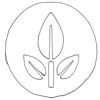

No beauty pageant winner, but good enough for what we want. Scan that bad boy in, (or girl as it may be) and then copy it into a good font creator like Font Magic. Why a font application, you rightly ask? Because we only want a simplified ray tracing of the image, not the data in the image itself. In other words, we want the formula for the curves.

Now I'm not going to bore you with the rest, but once the image is scanned into the font program, the lines are smoothed, it's saved as a unique font letter and then imported into Windows. Photoshop is launched and the letter is typed, rasterized, mirrored (because I only smoothed one side of the image since mirroring it would make it more symmetrical than I could ever do by pushing around contour anchors), and then a few Photoshop effects are tossed into the mix. When done, the image is re-sized to 5.75 inches and we end up with:



Now that's more like it! Still, this was one of those easy projects that suddenly becomes a hornet's nest of details. But done is done, and that's all that matters. Now to put it on the car!

Wednesday, June 8, 2011

How To Make A Tribute Painting : Step Two


We're going to skip over the step where you lather a thick coat of Gesso onto the canvas that you've chosen for your painting and just assume that you've taken care of that already. Once the white surface has been prepared, you're ready to go.

Grab a pencil and sketch in the outline of the painting. For this step, it's more important to make the lines visible than to worry about whether the lines will show through the paint itself. It will. Let me put it another way, there is nothing you can do to hide the pencil lines used in the sketch. They will continue to show through the paint, ruining the overall effect and shining like a beacon of amaturishness that will blind anyone in the same room with thing when you're done. You might as well just give up and accept it.
Now there are those who think they'll be able to make the lines dark enough to be visible on the white surface, but light enough to disappear when painted over. The drawback towards this theory is that it is more likely to bite you, the painter, in the tookas. The first coat of paint will totally obliterate the lines which defeats the purpose of having a sketch in the first place. Relax and let it happen. The lines will show through and you'll deal with them when the time comes.

Now, take a good look at that picture I posted up there. See it? That's the best the painting is going to look like for a long, long time. Just like a dinner at Applebees, it's got to get worse before it gets better. The next few steps will seem like little more than deliberate efforts to deface the above image. So enjoy the view while you can.

As you can (barely) tell, I've sketched the full poster onto the canvas, cropping out the fence that was in the original image. "But why would you do something like that?" I hear you ask. Yes, the fence was part of the immerse world which Syberia is known for, but the point of having a tribute painting is actually making something that only existed in digital form before and bringing it into the corporeal world. For this reason, you just want to get the poster, not the scenery. "Yeah, but at the same time the world around the poster is just as much a part of the digitally created experience that I'm trying to capture. While the poster appears in the world as a hermetic element, nevertheless it is joined to its surroundings by tone which merges harmoniously with the experience. Wouldn't that necessitate capturing the fence in the painting as well?" you ask. To which I tell you to put a sock in it.

The various elements in the poster don't match exactly to the dimensions of the canvas, but it's close enough for our purposes. Let's take one last look at what we've got so far, and then go on to step three.

Monday, June 6, 2011

Dragon Queen Timeline

La Luche velvet painting based on the Psychonauts video game.  The queen of hearts is painted with inks on canvas.
(Click on the image to get the full effect. Dunno why it's not displaying correctly on this page.)

Here is a timeline progression for the dragon in the "Psycho" series of paintings. At the start of the series, almost all the color had been applied with the exception of black. The rest of the images just show the difference that black made to the overall piece.

I did do some color touch-ups here and there, but for the most part, it was complete on day one!