Here's just such a project, documented for ya.
I wanted to make the "Life" logo that appears on Eve in the movie "Wall-E". When the robot takes a plant sample for analysis, a glowing green light appears on her surface. The light has a stylized tree design. It's a simple logo but very pleasing. For reasons I won't go into here, I wanted to make a sticker of that logo and put it onto the gas cover of a Honda Fit.
This should be simple because Wall-E is an insanely popular movie and if there's one thing that the Internet is good for it's pirating images from popular entertainment. A quick check with a ruler showed me that the gas tank cover was approximately 5.75 inches across, which means I'd need an image from the internet with a high enough resolution that it won't dissolve into a pixelated mess when it's printed to that size.
After lots of searching around, this is the best I could get my hands on:

Yeah, that's it. The image looks fine when when seen in the original picture, but blow it up to any workable size and all the detail becomes a muddy mess. Times like this call for Photoshop. Sort of.
First off, we don't want to confuse PhotoShop with details from the image. You and I see only two colors in the above image, yellow and green. PhotoShop recognizes the thousands of shades between them gets all funny when asked to differentiate the hues. There are tools in the application which help, like increasing the contrast in the image, reducing the palette and then selecting one of the colors and having the program select all similar shades of the specified sample.
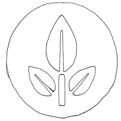
Or you could do a quick tracing with a pen. That's my method. Trace and scan, and you get this:

No beauty pageant winner, but good enough for what we want. Scan that bad boy in, (or girl as it may be) and then copy it into a good font creator like Font Magic. Why a font application, you rightly ask? Because we only want a simplified ray tracing of the image, not the data in the image itself. In other words, we want the formula for the curves.
Now I'm not going to bore you with the rest, but once the image is scanned into the font program, the lines are smoothed, it's saved as a unique font letter and then imported into Windows. Photoshop is launched and the letter is typed, rasterized, mirrored (because I only smoothed one side of the image since mirroring it would make it more symmetrical than I could ever do by pushing around contour anchors), and then a few Photoshop effects are tossed into the mix. When done, the image is re-sized to 5.75 inches and we end up with:

Now that's more like it! Still, this was one of those easy projects that suddenly becomes a hornet's nest of details. But done is done, and that's all that matters. Now to put it on the car!

No comments:
Post a Comment